

1. The process of mutual learning or in modern electronics is called
Artificial intelligence and smart work.
2. the process of delivering and receiving symbols or symbols
symbol of communication, if in modern humans commonly called
learn languages and in the electronics world called work sheets,
electronic circuit, Hardware and software and communication
electronics.
3. Adaptive adjustment mechanism, in the world
modern humans are called: socialization, role play,
identification, projection, aggression and in modern electronics
called Adaptive devices, Transmissions, Signal conditioners and others
so .
- Business decision mapping.
- Data visualization.
- Graphic communication.
- Info graphics.
- Information design.
- Knowledge visualization.
- Mental model.
- Morphological analysis.
- electronic design
- Strong and weak of device
- Aging Electronic device
- Electronic Instrument and Control
- Satellite Loading
- Scanner of point missing
- ROBO__ADAPTIVE
- Tracking Space and Time of the other Planet outside Earth
- Social Function and Distribution line Project .
- Mapping Area
- e- Money Transaction
- 1) Verbal Communication.
- 2) Non-verbal / Interpersonal communication.
- 3) Written Communications.
- 4) Formal &Informal.
- 5) Visual Communication.
- 6) Symbolic Communication in Electronic Design
- 7) Formula Communication in Electronic_Physic
Graphic communication as the name suggests is communication using graphic elements. These elements include symbols such as glyphs and icons, images such as drawings and photographs, and can include the passive contributions of substrate, color and surroundings. It is the process of creating, producing, and distributing material incorporating words and images to convey data, concepts, and emotions.
The field of graphic communications encompasses all phases of the graphic communications processes from origination of the idea (design, layout, and typography) through reproduction, finishing and distribution of two- or three-dimensional products or electronic transmission .Graphic communication involves the use of visual material to relate ideas such as drawings, photographs, slides, Symbolic character , Formula design , mapping area , Tracking and sketches. The drawings of plans and refinements and a rough map sketched to show the way could be considered graphical communication.
Any medium that uses a graphics to aid in conveying a message, instruction, or an idea is involved in graphical communication. One of the most widely used forms of graphical communication is the drawing to designGraphics can be functional or artistic. The latter can be a
recorded version, such as a photograph and Tracking moving object, or an interpretation by a
scientist to highlight essential features, or an artist, in which case
the distinction with imaginary graphics may become blurred.
Communication is the process whereby information is imparted by a sender to a receiver via a medium. ( Manual medium ( Audio ) , Electronic Medium , Optic Medium , and then 5 natural forming medium of the earth: water, wind, fire, earth, clouds ) It requires that all parties have an area of communicative commonality. There are auditory means, such as speaking, singing and sometimes tone of voice, and nonverbal, physical means, such as body language, sign language, paralanguage, touch, eye contact, by using writing. Communication is defined as a process by which we assign and convey meaning in an attempt to create shared understanding. This process requires a vast repertoire of skills in intrapersonal and interpersonal
processing, listening, observing, speaking, questioning, analyzing, and
evaluating. if you use these processes it is developmental and
transfers to all areas of life: home, school, community, work, and
beyond. It is through communication that collaboration and cooperation occur .
Visual communication as the name suggests is communication
through visual aid. It is the conveyance of ideas and information in
forms that can be read or looked upon. Primarily associated with two dimensional images, it includes: signs, typography, drawing, graphic design, illustration, colour and electronic resources. It solely relies on vision. It is a form of communication with visual effect. It explores the idea that a visual message with text has a greater power to inform, educate or persuade
a person. It is communication by presenting information through Visual
form. The evaluation of a good visual design is based on measuring
comprehension by the audience, not on aesthetic or artistic preference.
There are no universally agreed-upon principles of beauty and ugliness.
There exists a variety of ways to present information visually, like gestures,
body languages, video and TV. Here, focus is on the presentation of
text, pictures, diagrams, photos, et cetera, integrated on a computer
display. The term visual presentation is used to refer to the actual
presentation of information. Recent research in the field has focused on
web design and graphically oriented usability. Graphic designers use methods of visual communication in their professional practice as like as Whats App , Zoom , Instagram .
Communication design is a mixed discipline between design and information-development which is concerned with how intermission such as printed, crafted, electronic media or presentations communicate with people. A communication design approach is not only concerned with developing the message aside from the aesthetics
in media, but also with creating new media channels to ensure the
message reaches the target audience. Communication design seeks to
attract, inspire, create desires and motivate the people to respond to
messages, with a view to making a favorable impact to the bottom line of
the commissioning body, which can be either to build a brand, move
sales, or for humanitarian purposes. Its process involves strategic business thinking, utilizing market research, creativity, and problem-solving , build of technical design .
The term graphic design can refer to a number of artistic and professional disciplines which focus on visual communication and presentation. Various methods are used to create and combine symbols, images and/or words to create a visual representation of ideas and messages. A graphic designer may use typography, visual arts and page layout techniques to produce the final result. Graphic design often refers to both the process (designing) by which the communication is created and the products (designs) which are generated for new Product device in continuous Improvement .
Common uses of graphic design include magazines, advertisements, product packaging and web design. For example, a product package might include a logo or other artwork, organized text and pure design elements such as shapes and color which unify the piece. Composition is one of the most important features of graphic design especially when using pre-existing materials or diverse elements.
Technical drawing, drafting or drawing, is the act and discipline of composing drawings that visually communicate how something functions or is constructed.
Technical drawing is essential for communicating ideas in industry and engineering.
To make the drawings easier to understand, people use familiar symbols, perspectives, units of measurement, notation systems, visual styles, and page layout. Together, such conventions constitute a visual language and help to ensure that the drawing is unambiguous and relatively easy to understand.


Technical illustration is the use of illustration to visually communicate information of a technical nature. Technical illustrations can be component technical drawings or diagrams. The aim of technical illustration is "to generate expressive images that effectively convey certain information via the visual channel to the human observer".
The main purpose of technical illustration is to describe or explain these items to a more or less nontechnical audience. The visual image should be accurate in terms of dimensions and proportions, and should provide "an overall impression of what an object is or does, to enhance the viewer’s interest and understanding of technical object . 

work of design


To design any electronic circuit, either analog or digital, electronic engineers need to be able to predict the voltages and currents so do signal pulse at all places within the circuit. Linear circuits, that is, circuits wherein the outputs are linearly dependent on the inputs, can be analyzed by hand using complex analysis. Simple nonlinear circuits can also be analyzed in this way. Specialized software has been created to analyze circuits that are either too complicated or too nonlinear to analyze by hand.
Circuit simulation software allows engineers to design circuits more efficiently, reducing the time cost and risk of error involved in building circuit prototypes. Some of these make use of hardware description languages such as VHDL or Verilog.
Network simulation software
More complex circuits are analyzed with circuit simulation software such as SPICE , EMTP., ORCAD.
Linearization around operating point
When faced with a new circuit, the software first tries to find a steady state solution wherein all the nodes conform to Kirchhoff's Current Law and the voltages across and through each element of the circuit conform to the voltage/current equations governing that element.
Once the steady state solution is found, the software can analyze the response to perturbations using piecewise approximation, harmonic balance or other methods.
Piece-wise linear approximation
Software such as the PLECS interface to Simulink uses piecewise linear approximation of the equations governing the elements of a circuit. The circuit is treated as a completely linear network of ideal diodes. Every time a diode switches from on to off or vice versa, the configuration of the linear network changes. Adding more detail to the approximation of equations increases the accuracy of the simulation, but also increases its running time.
Synthesis
Simple circuits may be designed by connecting a number of elements or functional blocks such as integrated circuits.
More complex digital circuits are typically designed with the aid of computer software. Logic circuits (and sometimes mixed mode circuits) are often described in such hardware description languages as HDL, VHDL or Verilog, then synthesized using a logic synthesis engine.

Accessing Satellite Imagery
How do I acquire satellite imagery at regional scales?
How can I make image mosaics?
How can I use vector data?
How do I export images?
Learn how to access images based on filter criteria
Perform basic image manipulation, mosaicking, and visualization
Understand how to map functions across image collections
Learn how to export images for later use
Satellite Imagery at Regional Scales
Most satellite products are broken up into tiles for distribution. Global Landsat data is broken up in ~180 km2 scenes, with unique path/row identifiers. 455 scenes cover the United States. Each scene is currently imaged every 16 days by Landsat 8, and every 16 days by Landsat 7 (approximately 45 times each year). The edges of each path overlap, providing increased temporal frequency in these areas. However, cloudy skies during satellite overpass and other acquisition anomalies make certain scenes or pixels unusable.
455 Landsat scenes cover the United States:
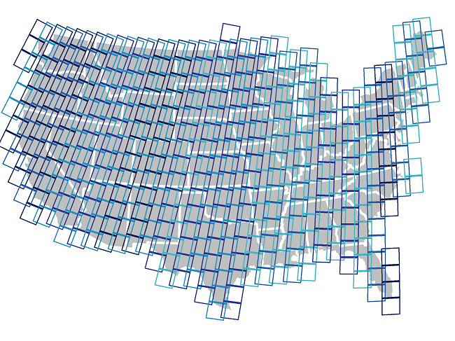
For most regional-scale applications, you will need to combine multiple satellite images to fully cover your spatial extent and fill in missing data caused by clouds, etc. Google Earth Engine (GEE) is particularly well suited to these tasks.
Basic GEE Workflow
Here, we will leverage GEE to create a composite satellite image representing the peak growing season for a watershed of interest.
Image Collections
A stack or time series of images are called Image Collections. Each data source available on GEE has it’s own Image Collection and ID (for example, the Landsat 5 SR collection, or the GRIDMET meteorological data collection).
You can also create image collections from individual images or merge
existing collections. More information on Image Collections can be found
here in the GEE Developer’s Guide.
In order to generate images that cover large spatial areas and to fill in image gaps due to clouds, etc, we can load a full ImageCollection
but filter the collection to return only the time periods or spatial
locations that are of interest. There are shortcut filters for those
commonly used (imageCollection.filterDate(),
imageCollection.filterBounds()…), but most filter in the ee.Filter() section of the Docs tab can be used. Read more about filters on the Developer’s Guide.
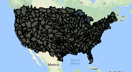
Load Vector Boundary
We’ll work on making a composite satellite image for a US watershed. The easiest way to filter for an irregular location without having to identify the paths and rows of the satellite image tiles is to use a vector polygon.
There are four ways to obtain vector data in GEE:
- Upload a shapefile directly to your personal Asset folder in the top left panel. You can create subfolders and set sharing permissions on these as needed. We use an asset vector file in the Accessing Satellite Imagery module.
- Import an existing Google Fusion Table, or create your own fusion table from a KML in WGS84. Each fusion table has a unique Id (File > About this table) that can be used to load it into GEE. GEE only recently added the Asset option, so you may see folks still using fusion tables in the forums, etc. If you have the choice, I’d use an asset.
- Use an existing vector dataset in GEE. (Browse the vector dataset catalog here)[https://developers.google.com/earth-engine/vector_datasets].
- Manually draw points, lines, and polygons using the geometry tools in the code editor. We do this in the Classify Imagery Module.
Here, we will use an existing vector asset, the USGS Watershed Boundaries - HUC12
In order to load a vector file from your Assets into your workspace, we need to use the “filepath” and cast it to a ee.FeatureCollection data type. Read more here under “Managing Assets” in the Developer’s Guide.
// load a polygon watershed boundary (here, a public vector dataset already in GEE)
// note: see tutorial linked above for guidance on importing vector datasets
var WBD = ee.FeatureCollection("USGS/WBD/2017/HUC06");
print(WBD.limit(5));
Map.addLayer(WBD, {}, 'watersheds')
The Inspector Tool
The “Inspector” tool allows you to query map layers at a point. We will use this to help us select a specific watershed. To use the inspector tool, click on the “Inspector” tab in the upper right panel to activate it. Then click anywhere within the Map Viewer. The coordinates of your click will be displayed, along with the value for map layers at that point.
We can use this to find the “name” attribute of our watershed of interest (pick any you want!).
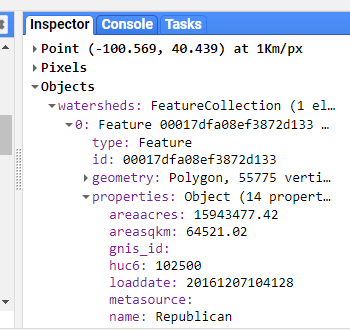
Once you’ve determined the “name” property for your watershed, use the featureCollection.filterMetadata() function to extract this watershed from the full dataset.
// use the inspector tool to find the name of a watershed that interests you
var watershed = WBD.filterMetadata('name', 'equals', 'Republican');
print(watershed);
// set the map view and zoom level, and add watershed to map
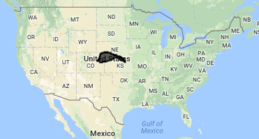
Map.centerObject(watershed,7);
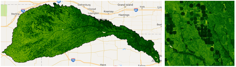
Map.addLayer(watershed, {}, 'watershed');Watershed of interest: The Republican River Basin
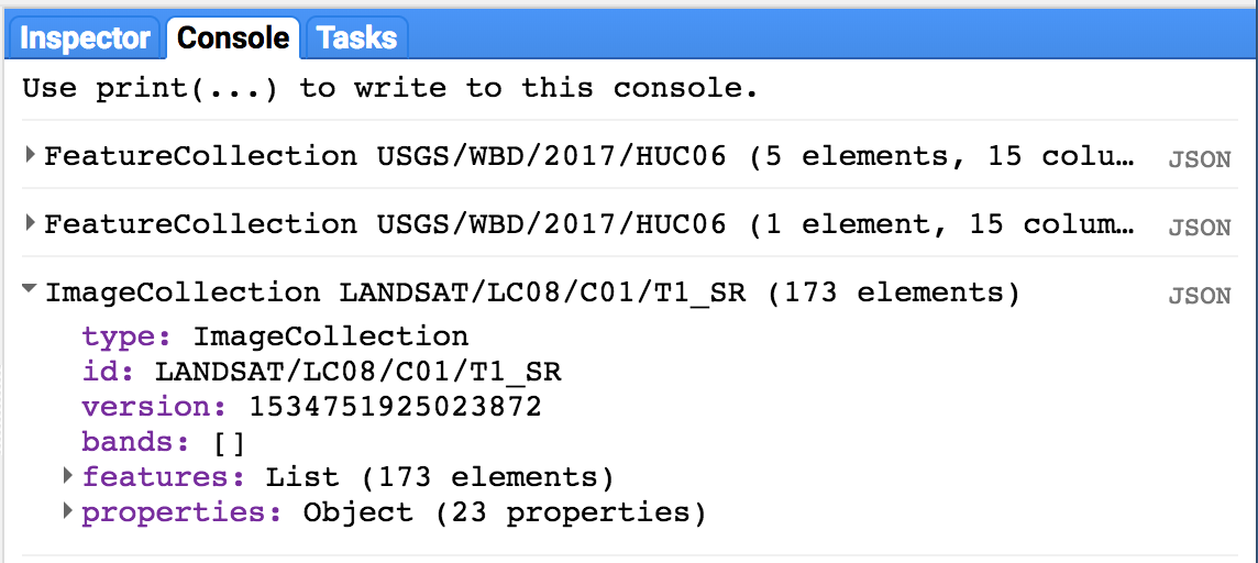
Filter an Image Collection
Here, we are selecting all imagery in the Landsat 8 Surface Reflectance collection acquired over our watershed anytime during last year.
Tip: Image collection IDs are found in the “Search” toolbar at the top of the code editor or through searching the data archive.
// load all Landsat 8 SR image within polygon boundary for last year
var l8collection = ee.ImageCollection('LANDSAT/LC08/C01/T1_SR')
          .filterBounds(watershed)
          .filterDate('2017-01-01', '2017-12-31');
print(l8collection);
Printing our filtered collection to console tells us how many images
are in our filter (173) as well as the band names and properties for the
images in our collection:
Mapping functions
As you can see by browsing the Docs tab in the upper left panel of the code editor, there are GEE functions specific to both the Image and ImageCollection
data types. There are a lot, including mathematical and boolean
operators, convolutions and focal statistics, and spectral
transformations and analyses of spatial texture. Browse the list, or
read about general operations available in the GEE Developer’s Guide “Image Overview”” section.
Often, we want to use a function over each image in an image collection. To do so, we need to essentially “loop” through each image in the image collection. In GEE, “loops” are accomplished with the .map() function.
Avoid actual loops at all costs. Using a for loop brings the operation into the browser (bad). Using imageCollection.map() sends the operation to Google’s servers for distributed runs (good). Loops implemented in typical for loop fashion bring the operation into the browser, and won’t work well, if at all.
More information about mapping functions over image collections can be found here in the Developer’s Guide.
The .map() concept applies to featureCollections
as well - to apply a function to each feature in a collection, we map
that function across the featureCollection with featureCollection.map().
See “Mapping over a Feature Collection” in the Developer’s Guide.
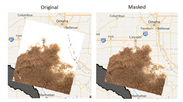
Masking clouds
Here, we’ll make use of the pixel_qa
cloud band provided with the SR products to mask pixels with clouds,
cloud shadows, and snow. We will mask pixels in the image based on the
value of pixel_qa.
We explicitly define a new function called “maskClouds” and apply it to each image in the imageCollection by using imageCollection.map(). Functions need to explicitly return the final output.
// Mask pixels with clouds and cloud shadows -------------------------------------

// Surface reflectance products come with a 'pixel_qa' band
// that is based on the cfmask. Read more here:
// https://landsat.usgs.gov/landsat-surface-reflectance-quality-assessment

// create function to mask clouds, cloud shadows, snow
var maskClouds = function(image){
  // make a new single band image from the pixel qa band
  var pixel_qa = image.select('pixel_qa');
  // keep clear (0) and water (1) pixels
  return image.updateMask(pixel_qa.eq(322));
};

// use "map" to apply the function to each image in the collection
var l8masked = l8collection.map(maskClouds);

// visualize the first image in the collection, pre- and post- mask
var visParams = {bands: ['B4','B3','B2'], min: 150, max: 2000}

Map.addLayer(ee.Image(l8masked.first()), visParams, 'clouds masked', false)
Map.addLayer(ee.Image(l8collection.first()), visParams, 'original', false)
Calculating NDVI as a New Band
Similarly, if we want to calculate the NDVI in each image and add it
as a new band, we need to create a function and map it over the
collection. Here, we use the normalizedDifference() function. The Mathematical Operations page in the GEE Developer’s Guide provides more information about simple and complex raster calculations.
// create function to add NDVI using NIR (B5) and the red band (B4)
var getNDVI = function(img){
  return img.addBands(img.normalizedDifference(['B5','B4']).rename('NDVI'));
};

// extra example: an equivalent function using straight band math
var getNDVI2 = function(img){
  return img.addBands(img.select('B5').subtract(img.select('B4'))
            .divide(img.select('B5').add(img.select('B3'))));
};

// map over image collection
var l8ndvi = l8masked.map(getNDVI);

// print one image to see the band is now there
print(ee.Image(l8ndvi.first()));
Create an “Greenest Pixel” Composite
We now need to assemble the image collection to create one continuous
image across the watershed. There are several mosaicking/compositing
options available, from simple maximum value composites (imageCollection.max()) and straightforward mosaics with the most recent image on top (imageCollection.mosaic()). The Compositing and Mosaicking page on the Developer’s Guide provides examples of these.
Here, we will use the imageCollection.qualityMosaic()
function. By prioritizing the image to use based on one specific band,
this method ensures that the values across all bands are taken from the
same image. Each pixel gets assigned the values from the image with the
highest value of the desired band.
We will use this to make a “greenest pixel composite” for our watershed based on the NDVI band we just calculated. The final composite image will retain all bands in the input (unless we were to specify otherwise). Each pixel in the composite image could potentially come from imagery acquired on different dates, but all bands within each pixel are from the same image. In general, this provides the best available snapshot of the landscape at the peak of the growing season, regardless of the phenological timing within the year.
// for each pixel, select the "best" set of bands from available images
// based on the maximum NDVI/greenness
var composite = l8ndvi.qualityMosaic('NDVI').clip(watershed);
print(composite);

// Visualize NDVI
var ndviPalette = ['FFFFFF', 'CE7E45', 'DF923D', 'F1B555', 'FCD163', '99B718',
               '74A901', '66A000', '529400', '3E8601', '207401', '056201',
               '004C00', '023B01', '012E01', '011D01', '011301'];
Map.addLayer(composite.select('NDVI'),
            {min:0, max: 1, palette: ndviPalette}, 'ndvi');
Annual maximum NDVI across this watershed highlight irrigated agricultural areas:
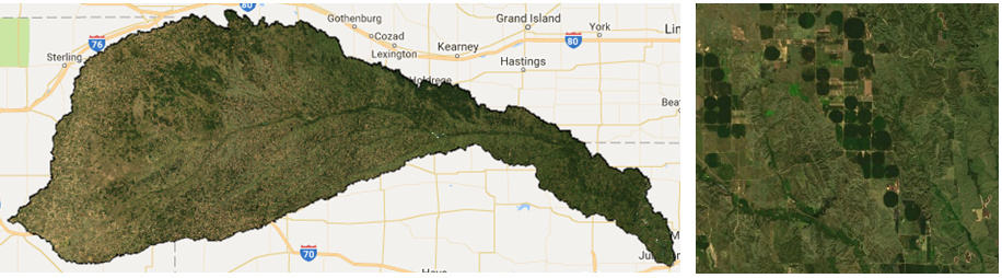
We can also use this composite image to visualize a true color composite using the RGB bands:
// Visualize true color composite
Map.addLayer(composite, {bands: ['B4', 'B3', 'B2'], min: 0, max: 2000}, 'true color composite', false);
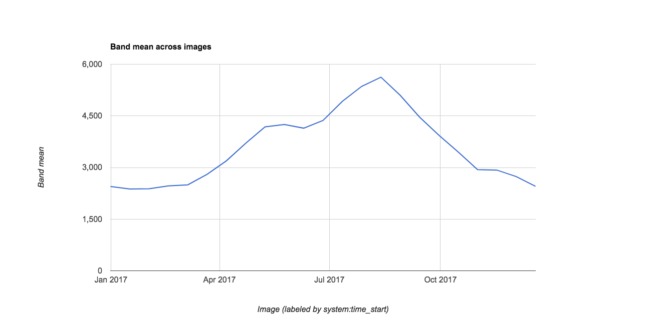
Visualize Data in a Chart
To briefly illustrate GEE’s ability to display data charts, we load a MODIS NDVI data product to chart the annual time series of mean NDVI for our watershed. Charting is also covered in the Spatial and Temporal Reducers Module.
// Chart annual time series of mean NDVI in watershed
// from our Landsat 8 computed NDVI
var chart = ui.Chart.image.series({
    imageCollection: l8ndvi.select('NDVI'),
    region: watershed,
    reducer: ee.Reducer.mean(),
    scale: 250,
})
print(chart)  //** Can export the figure or data in the pop-out


// You can also compare to the MODIS 16 day product

// add satellite time series: MODIS NDVI 250m 16 day product
var modis = ee.ImageCollection('MODIS/006/MOD13Q1')
          .filterBounds(watershed)
          .filterDate('2017-01-01', '2017-12-31')
          .select('NDVI');

// Chart annual time series of mean NDVI in watershed
// from the smoothed MODIS 16 day product
var chart = ui.Chart.image.series({
    imageCollection: modis,
    region: watershed,
    reducer: ee.Reducer.mean(),
    scale: 250
})
print(chart)
Note you can export the chart’s underlying data using the arrow pop-out icon..
Exporting Data as a Table
The most memory-efficient way to get data out of GEE is in a table. This way has the benefit of being scripted and thus fully reproducible. Table exports also require much less compute power than exporting a whole image. When you are constructing an analysis, think hard about how you can leave the raster in the cloud and just extract the data you need as an array.
// Use the buttons on the pop-out chart to export the .csv, or you can script
// the export as follows using a reducer:
// get the mean value for the region from each image
var ts = modis.map(function(image){
var date = image.get('system:time_start');
var mean = image.reduceRegion({
reducer: ee.Reducer.mean(),
geometry: watershed,
scale: 250
});
// and return a feature with 'null' geometry with properties (dictionary)
return ee.Feature(null, {'mean': mean.get('NDVI'),
'date': date})
});
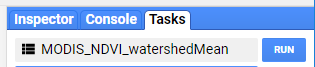
// Export a .csv table of date, mean NDVI for watershed
Export.table.toDrive({
collection: ts,
description: 'geohack_2017_MODIS_NDVI_stats',
folder: 'GEE_geohackweek',
fileFormat: 'CSV'
});
// AND HIT 'RUN' IN THE TASKS TAB IN THE UPPER RIGHT PANELTo execute export tasks, you need to then go to the ‘Tasks’ tab in the upper right panel and hit ‘Run’.
Exporting Images
Users can export the results of their image manipulations to their GEE Asset folder for downstream use within GEE or to their personal Google Drive or Google Cloud Storage accounts. Here, we export a single-band image of annual maximum NDVI for our watershed. Examples are provided for asset and Google Drive exports. More information on exporting can be found here in the Developers Guide.
In the JavaScript API, all exports are sent to the ‘Tasks’ tab in the upper right panel. To prevent users from inadvertently overwhelming the system with gratuitous, accidental tasks, you need to explicitly run individual exports from the ‘Tasks’ tab. You can change filenames and other parameters here if necessary, or hard code these into your script.
When exporting to Google Drive, GEE will find the named folder specified and does not need the full file path. If this folder does not yet exist, it will create it for you in your Drive.
// Export is unnecessary, but here are code examples for out to save a
// image composite if desired.

// select only the ndvi band
var ndvi = composite.select('NDVI');

// Google Drive Export Example
// (note: need to hit 'Run' in the task tab in upper right panel)
Export.image.toDrive({
  image: ndvi,
  description: 'geohack_2017_L8_NDVI_image',
  scale: 30,
  region: watershed.geometry().bounds(), // .geometry().bounds() needed for multipolygon
  crs: 'EPSG:5070',
  folder: 'GEE_geohackweek',
  maxPixels: 2000000000
});

// Asset Folder Export Example
// (note: need to hit 'Run' in the task tab in upper right panel)
Export.image.toAsset({
  image: ndvi,
  description: 'geohack_2017_L8_NDVI_image',
  assetId: 'users/yourname/geohack_2017_L8_NDVI_image',
  scale: 30,
  region: watershed.geometry().bounds(),
  pyramidingPolicy: {'.default':'mean'}, // use {'.default':'sample'} for discrete data
  maxPixels: 2000000000
});
Good Points
Regional satellite data can be accessed by loading a full image collection and filtering based on criteria such as time period and location
Images can be manipulated similar to raster math, and new bands can be calculated by mapping functions over image collections
Image composites can be generated quite quickly
Images and tables can be exported for future use within GEE or for outside software
From low to high, information fusion can be divided into three levels. The feature-level fusion not only keeps the most original information, but also overcomes the unstable and large characteristics of original data. Fusion feature can be effectively used in seam image recognition.
This is designs an automatic laser arc hybrid welding system basing on optical sensors. The system has the function of automatic control, which is convenient for setting and adjusting parameters, and the welding attitude control is stable and accurate. To a certain extent, it solves the problems of high requirements and poor adaptability of laser welding system in practical application, and improves the engineering adaptability of laser-arc hybrid welding.
Common architecture of a Moving Object Tracking module.


What is automatic time tracking?
Automatic time tracking represents a radical new approach to one of the business world’s most essential (and hated) administrative tasks. Doing away with manual timers and data entry, it uses smart digital technology and artificial intelligence to track and process your daily work activities. In doing so, it effectively removes the need to consciously track time or create time sheets. But how does it work in practice, and how is it any different from established digital time tracking?
Digital vs automatic time tracking
Modern work can be hard to keep up with. Our job titles and ways of working are increasingly fluid, meaning many of us juggle a lot of cross-functional responsibilities. A typical day can see us jumping between emails, Slacks and client calls, attending meetings to plan and sync with our teams, researching tools and industry news, and producing reports.
This work happens flexibly across an expansive toolset, with the average worker among us using 36 different cloud services in one day. And we don’t just work with one tool at a time – in fact, 68% of us switch apps 10 times an hour.
So how can we expect workers to accurately capture all of this themselves – especially in a way that doesn’t wrench their focus away from their work? This is the essential problem that automatic time tracking solves, and traditional digital time tracking doesn’t. This table lays out the main differences between the two:
For modern work forces operating across suites of digital tools, automatic time tracking is a no-brainer. It lets people focus fully on their work while enjoying full time compliance – minimizing human error and distraction in the process.
How does automatic time tracking work?
While the technology sounds complicated, from a user perspective automatic time tracking is remarkably straightforward. You just need to download an automatic time tracking app on your computer to get started.
There are essentially two main parts to automatic tracking: remembering what you work on and drafting accurate time sheets for you. Using the example of Timely, here’s how automatic trackers are able to do that:
1. Automatic data capture
It looks at the time you actively spend on web and desktop apps, capturing page titles and timestamps to present all your daily activities in a clean timeline:

That means every second of your work gets captured – from project work and internal team communication, to email, meetings and travel. But don’t worry –websites you browse in “private” or “incognito” won’t show up. ;) All this data and your timeline is completely private to you, so no boss or colleague can access it.
2. AI data grouping
Using artificial intelligence, automatic trackers can then translate this data into time sheets for you. You’ll need to log a few of your tracked activities first to effectively train it – so it knows how you categorize work and what you don't want to log publicly.

As a result of your training, your AI will work out the relationships between activities and understand the projects different pieces of work belong to. It even learns your logging preferences, making your time sheet as authentically "you" as possible. Over time, you can effectively outsource time sheet creation to your AI.
What isn’t automatic time tracking?
“Automation” has become somewhat of a buzzword in recent years, being liberally interpreted by marketers to sell technology which doesn’t actually qualify to use the term. Sadly, this puts greater pressure on consumers to self-educate and understand exactly what they’re getting from a new technology.
To avoid being mis-sold automatic time tracking, watch out for apps that still require you to:
- Start and stop timers to capture any time data
- Enter notes to provide context for time data
Remember, a tool promising to save you time does not necessarily use automation. Many time tracking tools that claim to be automated are actually just simplifying UI navigation – making time logging slightly easier to manage, but essentially keeping it manual.
